DESIGN JOURNEY WITH VECTORS
ベクターを使ったデザインの旅
8-Bit.Labs is a collection of vector illustrations that I made with Affinity Designer. Many of the featured concepts are dedicated to early videogame pop art culture [+=••] or are inspired by The Designers Republic from Sheffield (UK).
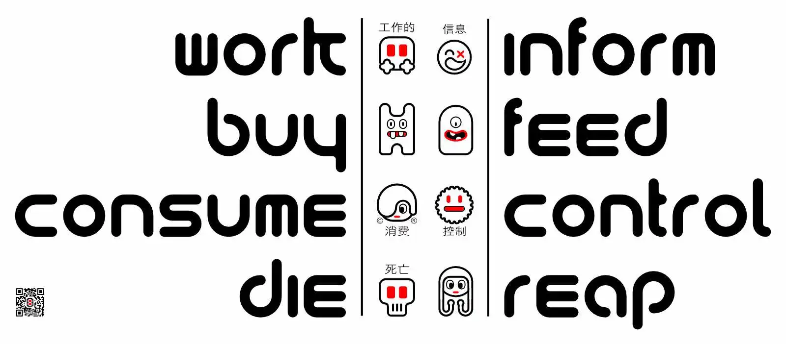
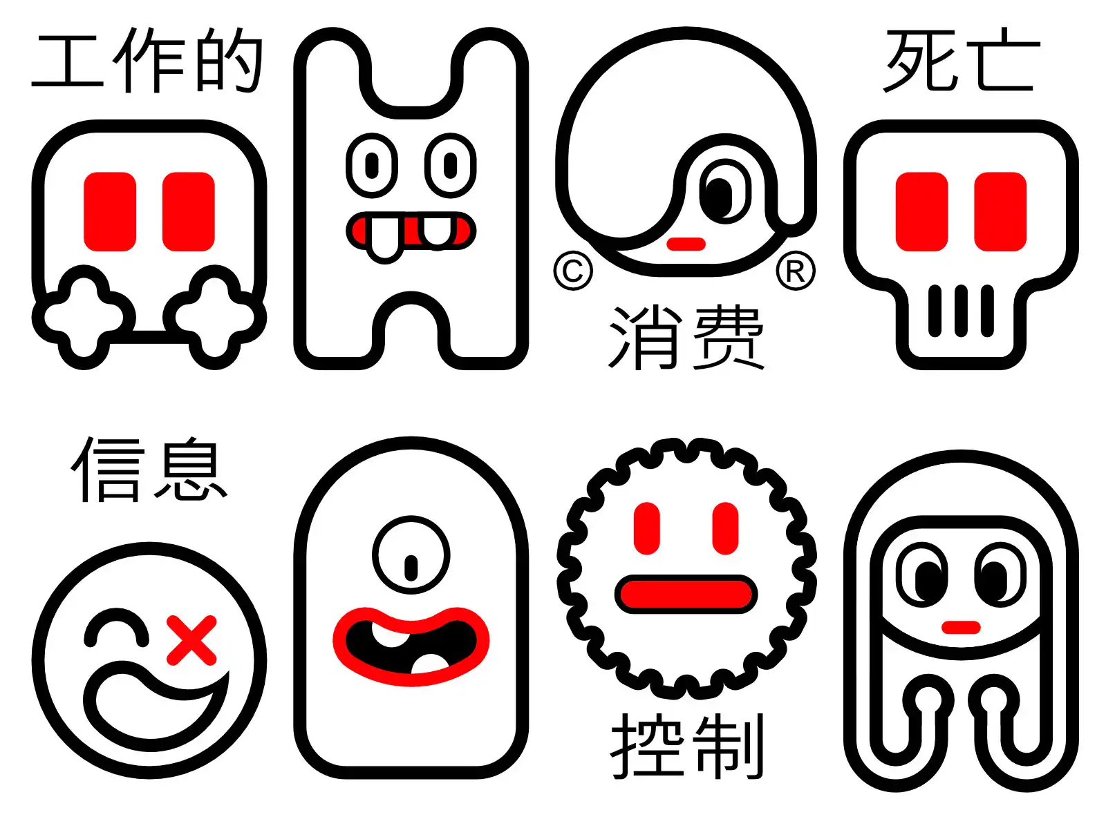
Work Buy Consume Die
働く、買う、消費する、死ぬ
Work buy consume die ... WTF is that? This is an anti-consumerism slogan from tDR. tDR? The Designers Republic (also tDR, and styled as The Designers Republic™) is a British graphic design studio based in Sheffield, England, founded in 1986 by Ian Anderson and Nick Phillips. They are best known for electronic music logos, album artwork, and anti-establishment aesthetics, embracing "brash consumerism and the uniform style of corporate brands". Work by tDR is held in the permanent collections of the Museum of Modern Art and the Victoria and Albert Museum. Work by the Designers Republic generally is viewed as "playful and bright" and considered Maximum-minimalist, mixing images from Japanese anime and subvertised corporate logos, with a postmodern tendency towards irony. It often features statements/slogans such as "Work Buy Consume Die", "Robots Build Robots", "Customized Terror", "Buy nothing, pay now", and "Made in the Designers Republic". They also celebrated their northern roots with phrases like "Made in the Designers Republic, North of Nowhere" and "SoYo" (referring to Sheffield's county of South Yorkshire) — affirming they were not from London's design community in Soho. Here comes my approach. I tried to adapt the simple design of tDR while using a mainly rounded corners and bold outlines.
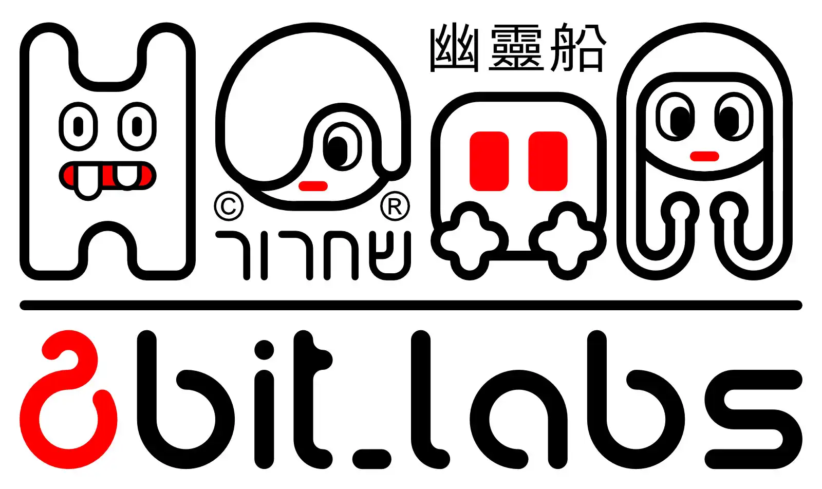
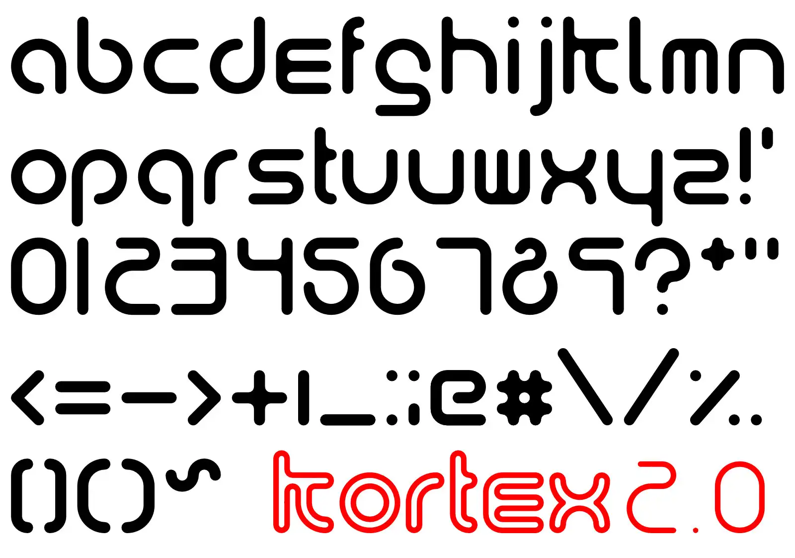
I also tried to reuse the concept for making a corporate design for a fantasy brand that I called "8-Bit.Labs". During the design process I designed letters of a concept font and renamed the Chinese descriptions or substituted them by Hebrew.
Designing a Font
フォントのデザイン
Let's design a font ... what a dumb idea :D!
Work Buy Consume Die: Reloaded
働く、買う、消費する、死ぬ:リローデッド
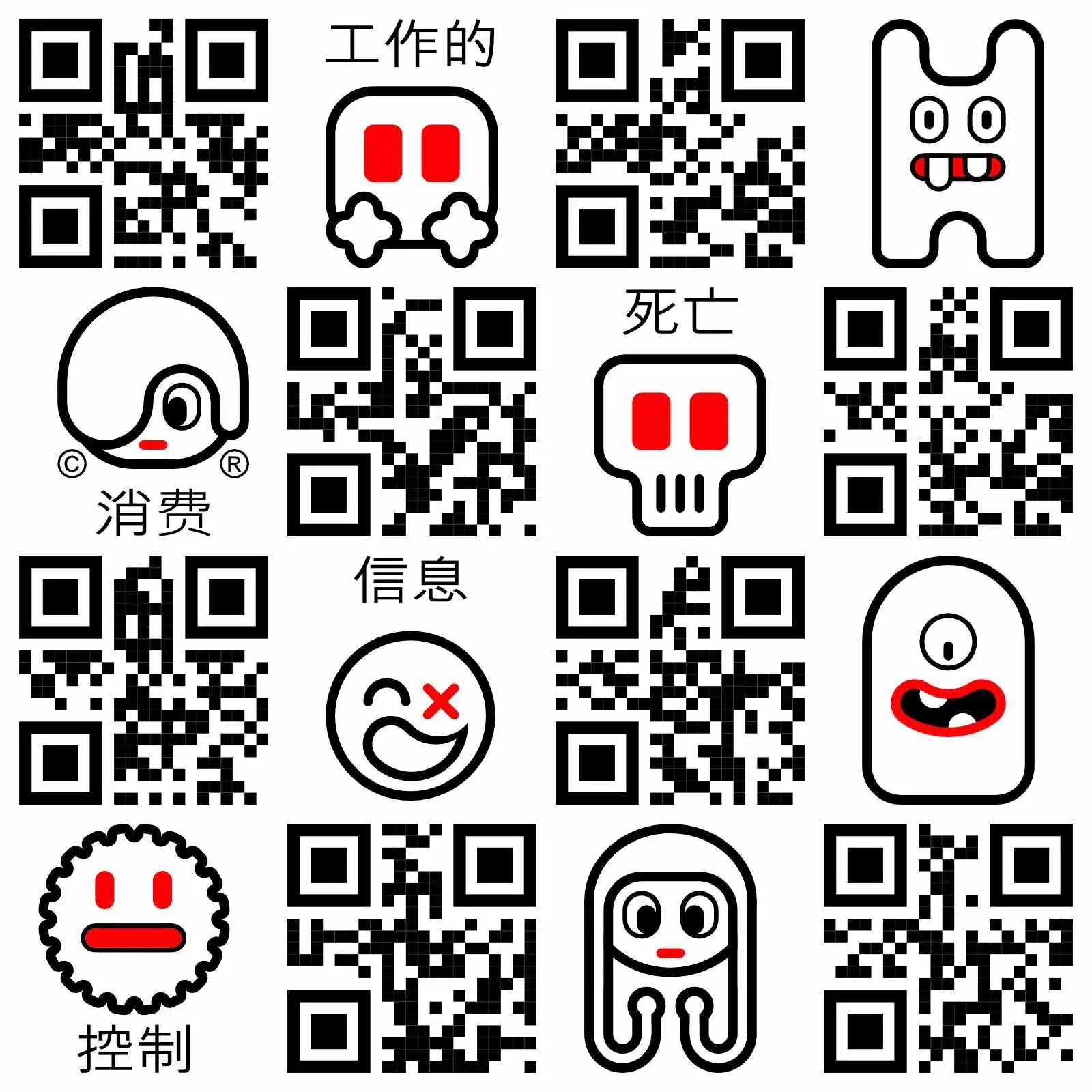
... work buy consume die inform feed control feed ... this is a design reload of my 1st try to adapt the original slogan and concept design of The Designers Republic from Sheffield (UK). Some people accept/ understand them, some people hate them. QR Codes are an established design element in the Human Machine Interface (HMI) context. In this concept I used QR codes heavily to describe the message behind the design. Without a device with a camera and an appropriate softzware to interpret the QR codes it is not possible to understand the message behind the design.
